Pursuit | A Collaging of Critical Art and Graphic Design
Undergraduate Thesis
Spring 2021
My undergraduate thesis lies at an intersection between my two favorite creative processes: street art and graphic design. Though stylistically different, they have several formal similarities. Both rely on a combination of text and image, visual consistency is crucial, and they’re public facing. This creates an interaction with all of society instead of just the people in a museum or gallery. Most fascinating to me is graffiti and graphic art’s tendency to subvert political authority and speak truth to power. Through satire, wordplay, or toying with images from mass culture, both mediums can cleverly and concisely illustrate mechanisms of domination and laws of exploitation.
For my thesis I wanted to blend the functionality of graphic design and the evocative impact of graffiti with themes of subversion and social action. With polarization, factionalism and hyperbolic talk driving us apart, art and design have a unique way of reflecting our reality back to us by distilling it into a digestible moment.
Type is a psychological art form, with tabloid sensibilities meant to grab your attention, communicate themes, and convey identities. Examining this application in graffiti and design led me to build my own font as the through-line of my project. The font I created is inspired by 19th century wood type which was identifiable in newspapers, broadside posters, and western bounty signs at that time. I loved the thick to thin slabby forms and large boxy serifs–maybe from their resemblance to certain styles in graffiti.
I was also intrigued that these typefaces represent a brutal time period in the United States’ history that is romanticized in mass culture through cowboys, rangers, the American West, and Manifest Destiny. I titled my font Pursuit as an ironic nod to the patriotic phrase “Pursuit of Happiness,” highlighting the double entendre in the word itself: a positive, self-driven attitude, versus an aggressive, hunter and hunted dynamic.
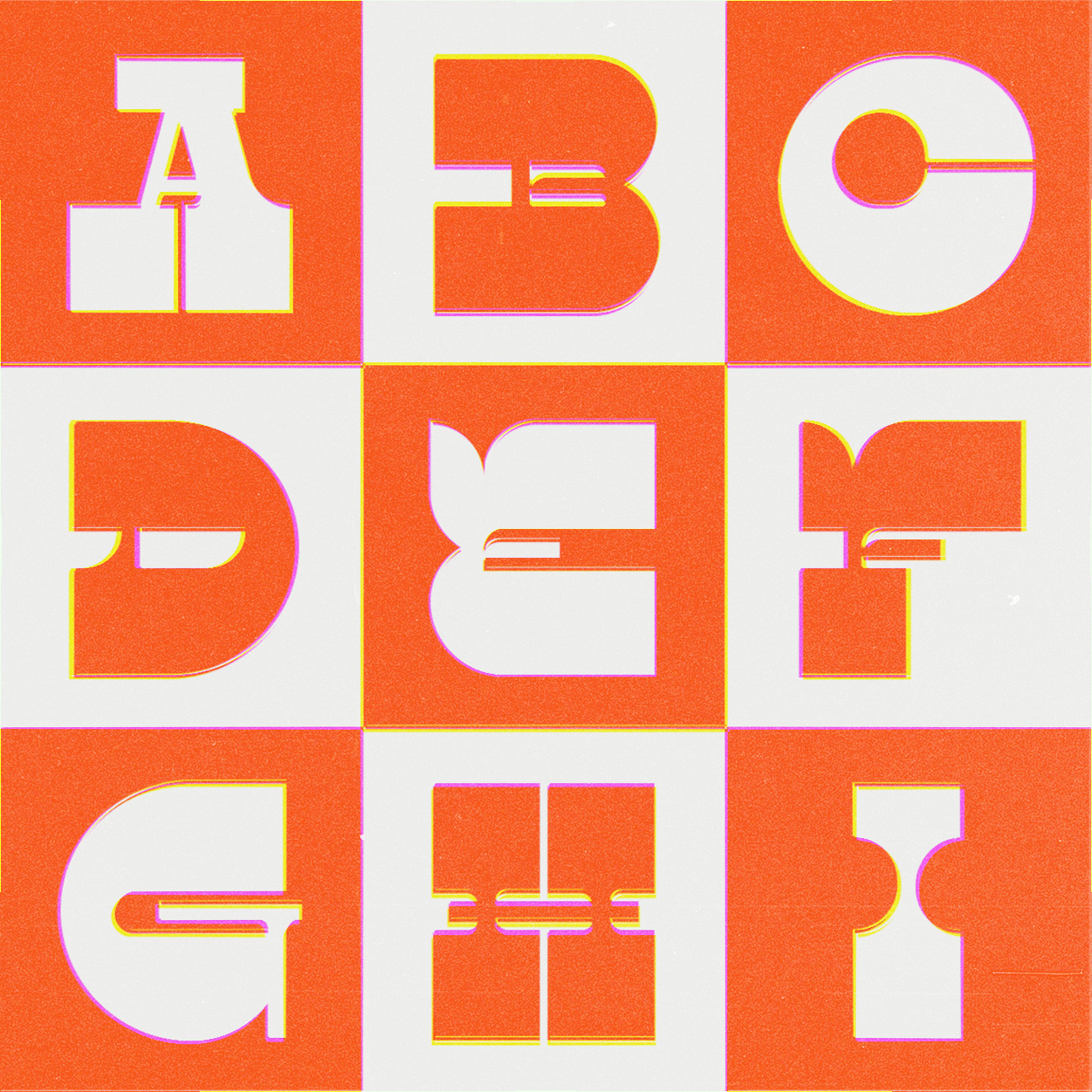
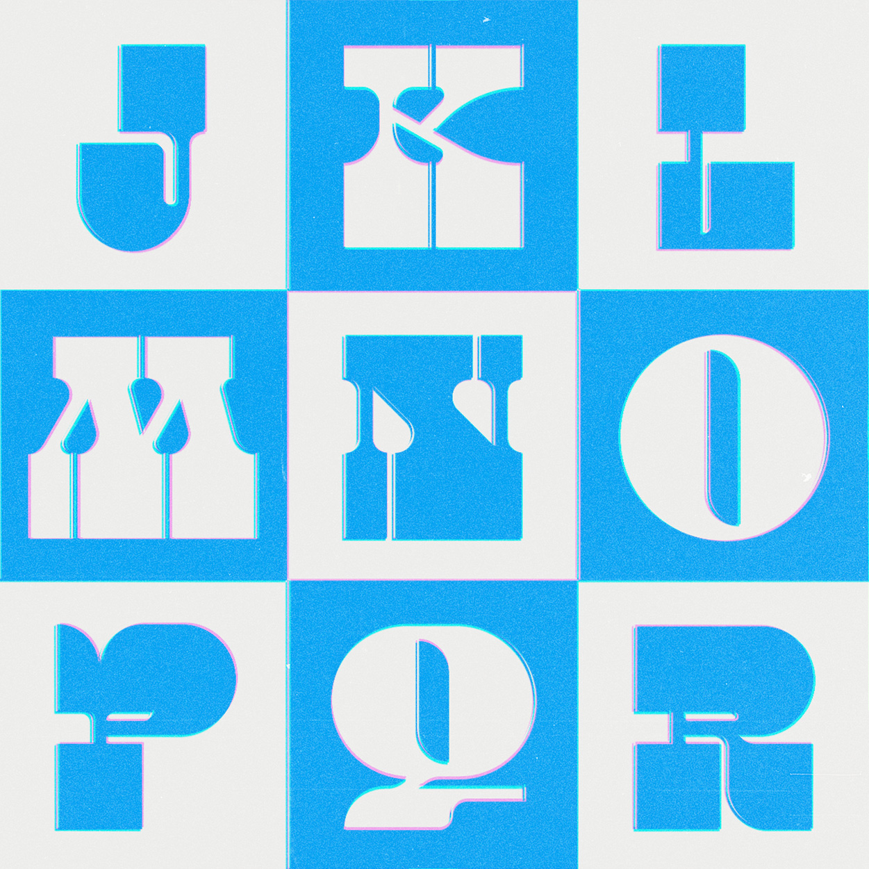
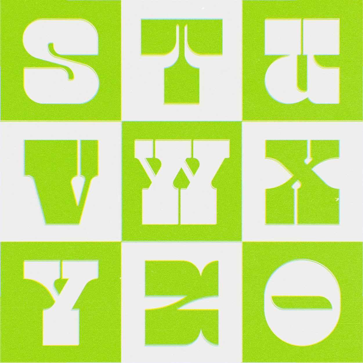
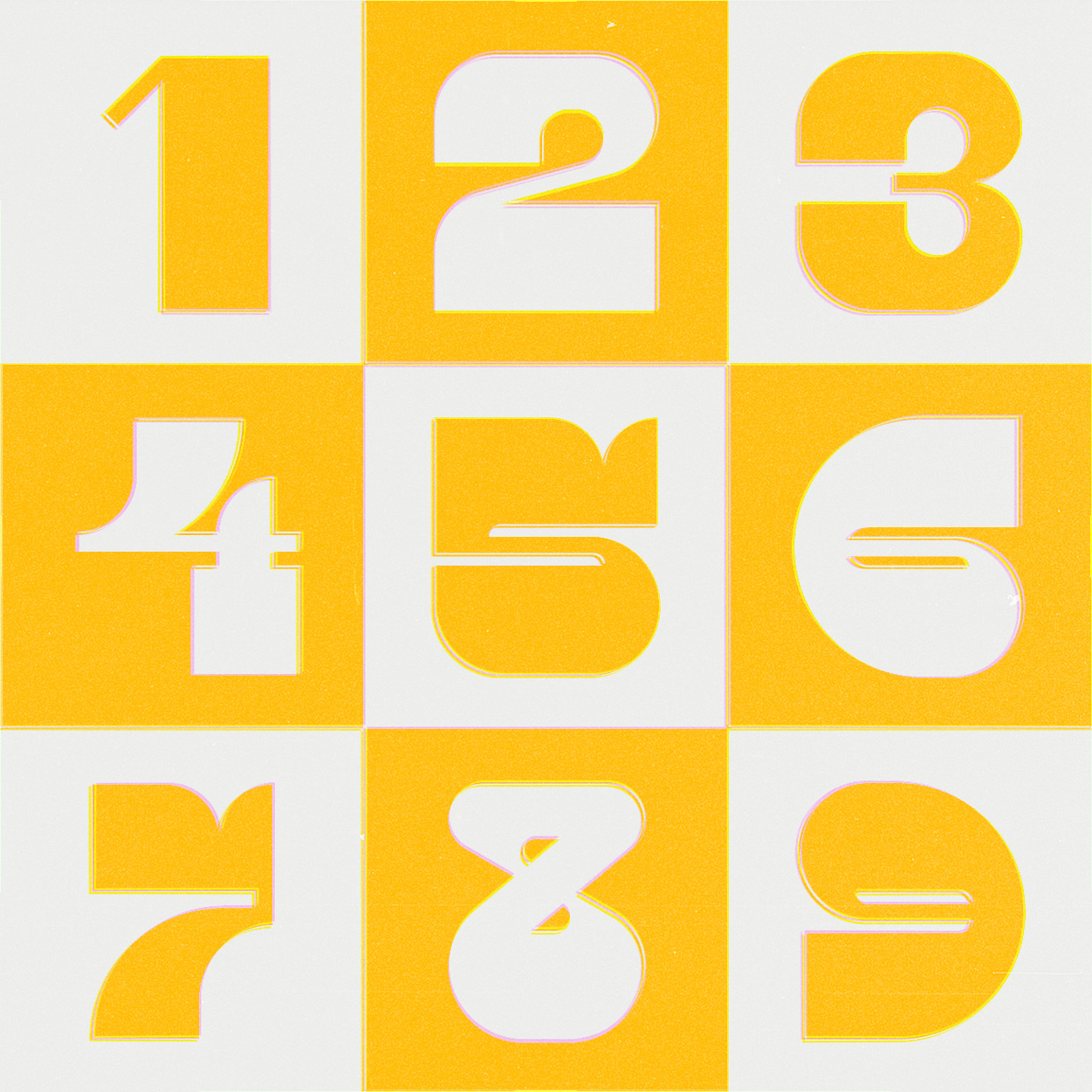
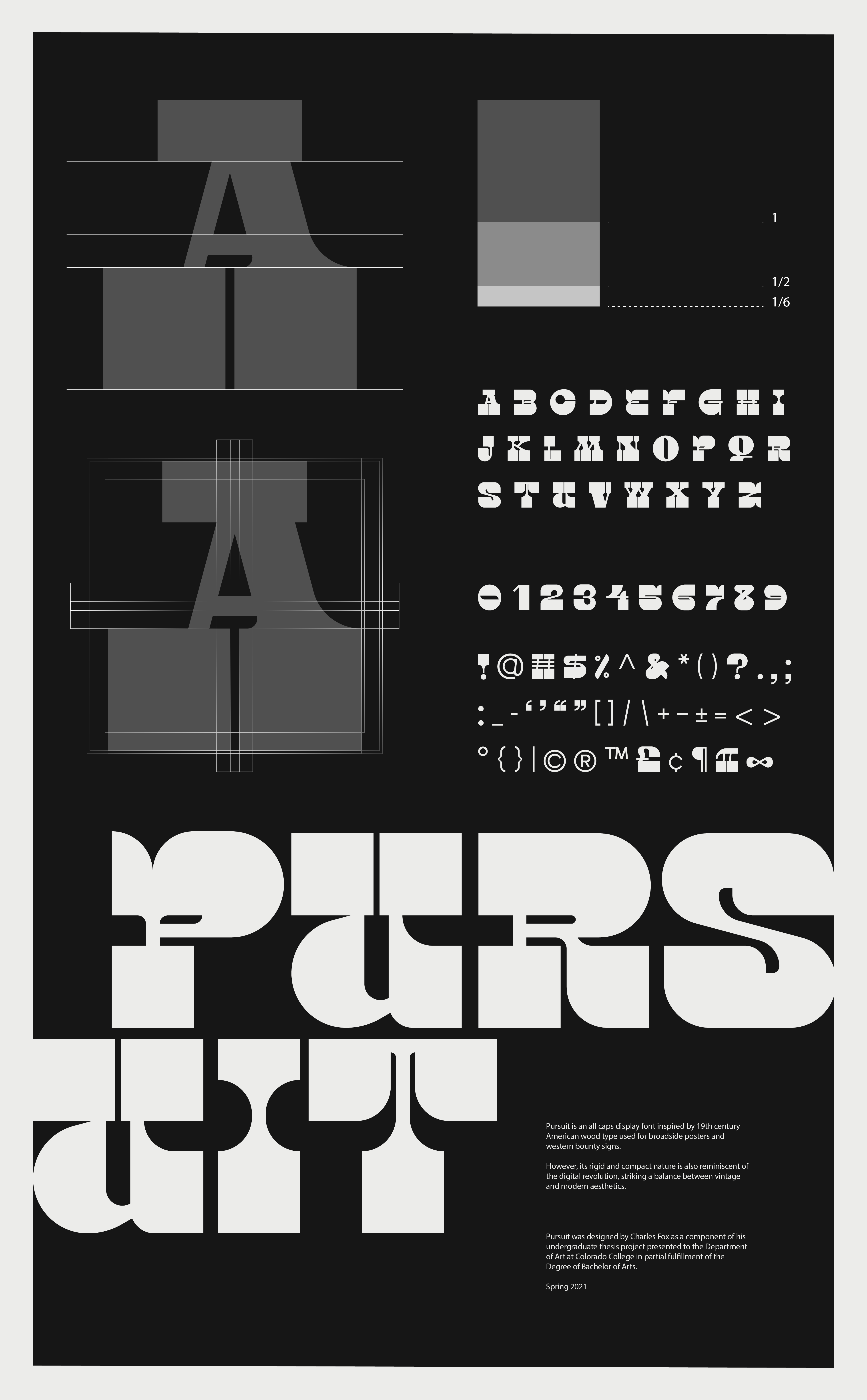
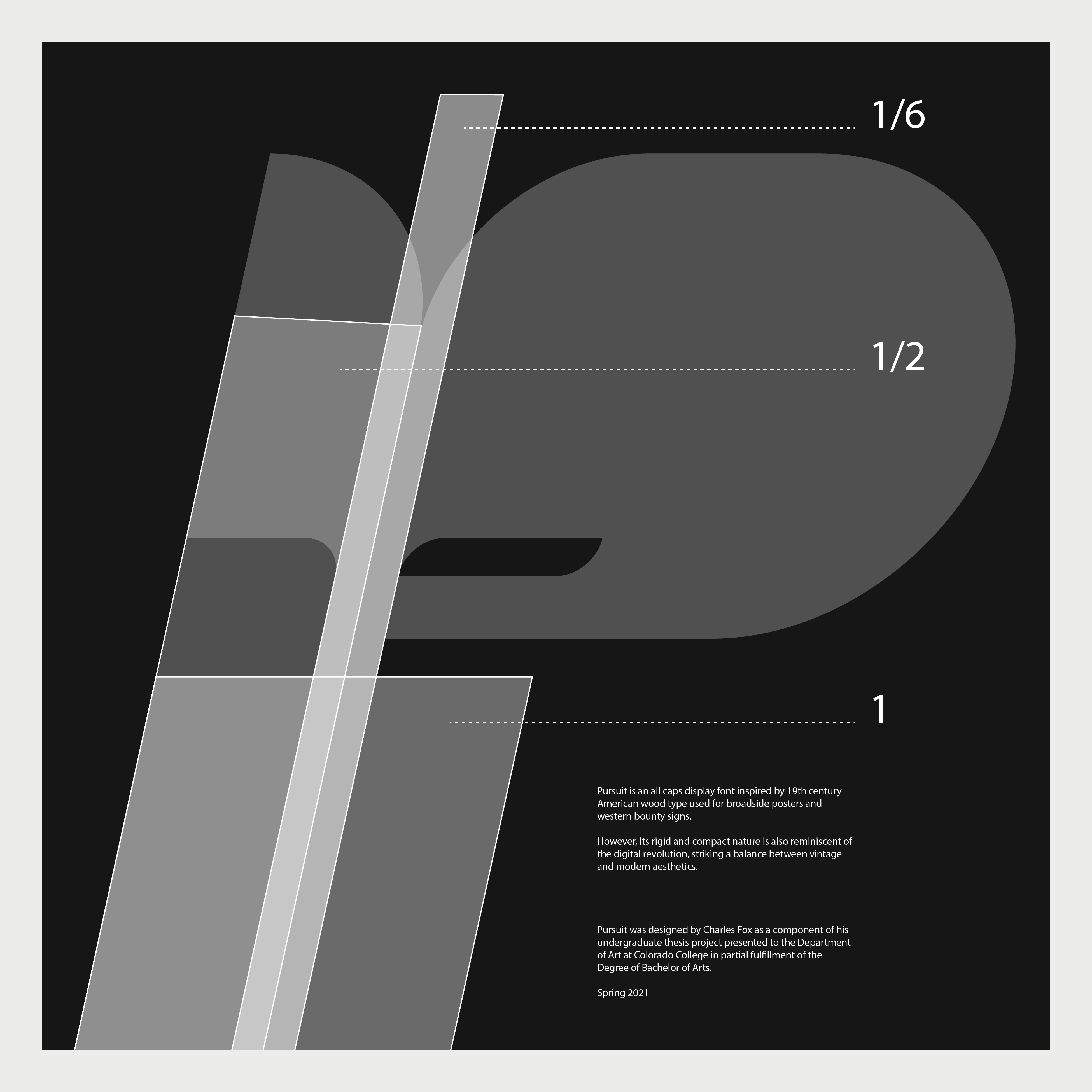
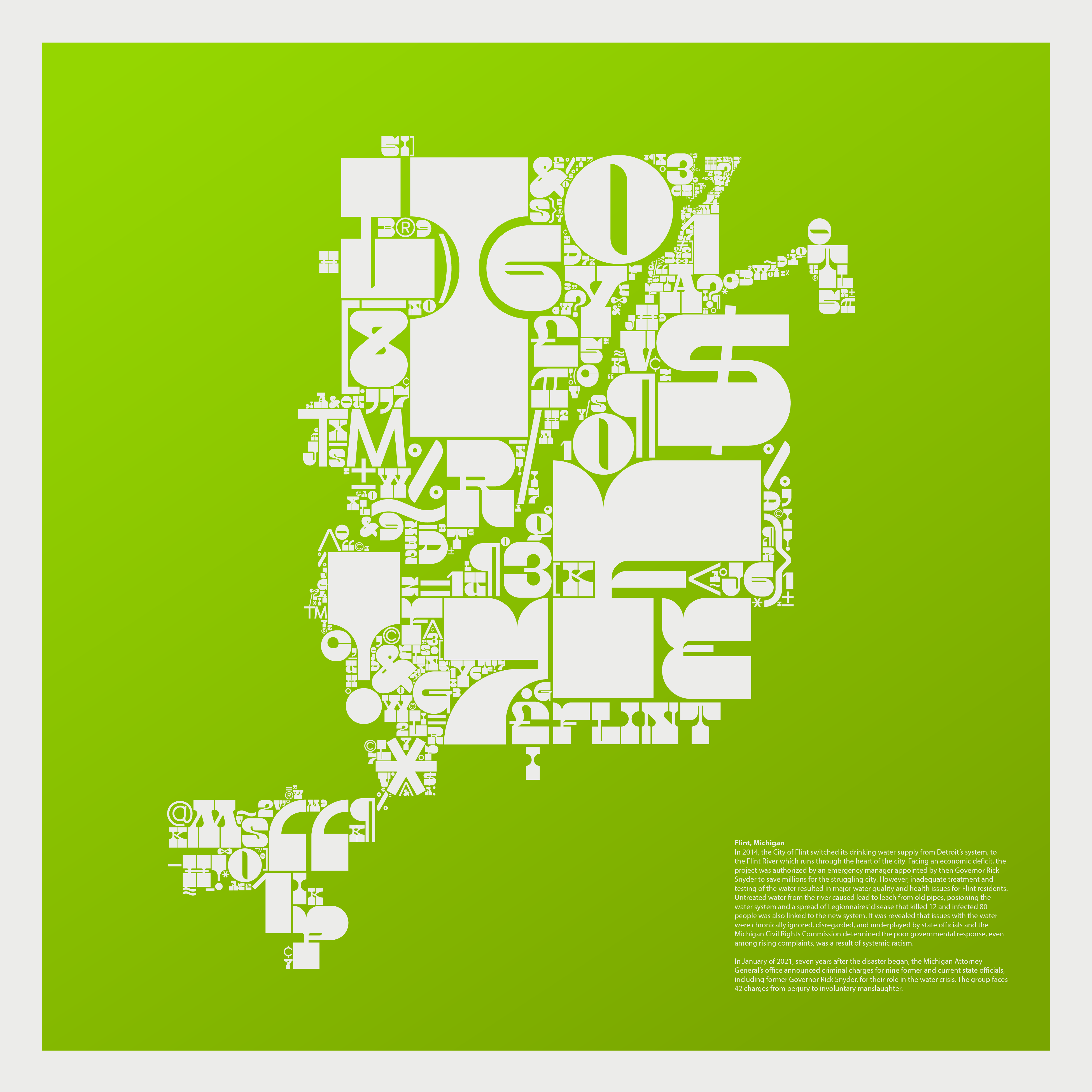
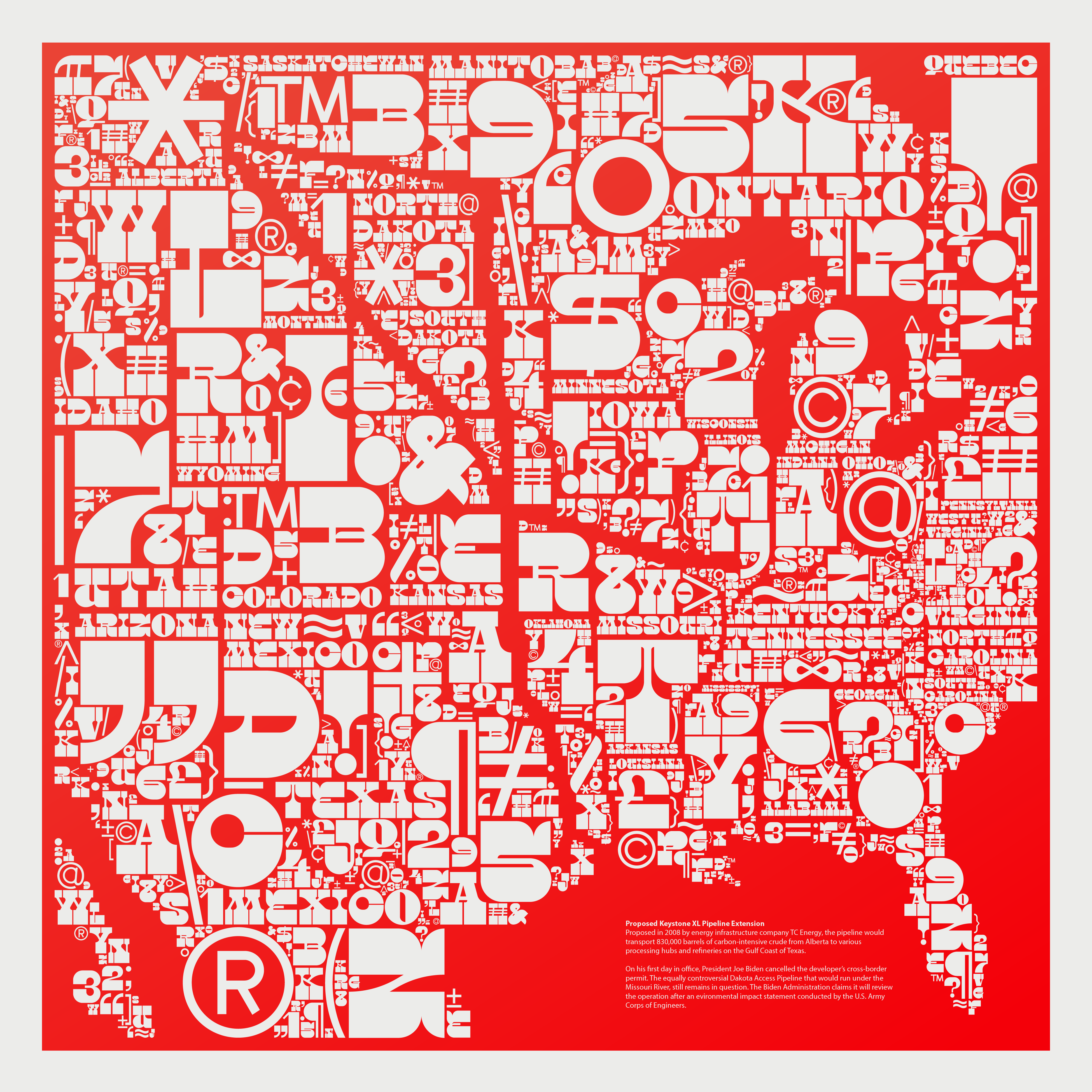
While making this font I thought about the inseparable link between the shape of a letter and our verbalized translation of them. They’re so hard to detach that I wondered how I could abstract letters in a way that somehow defined something else.
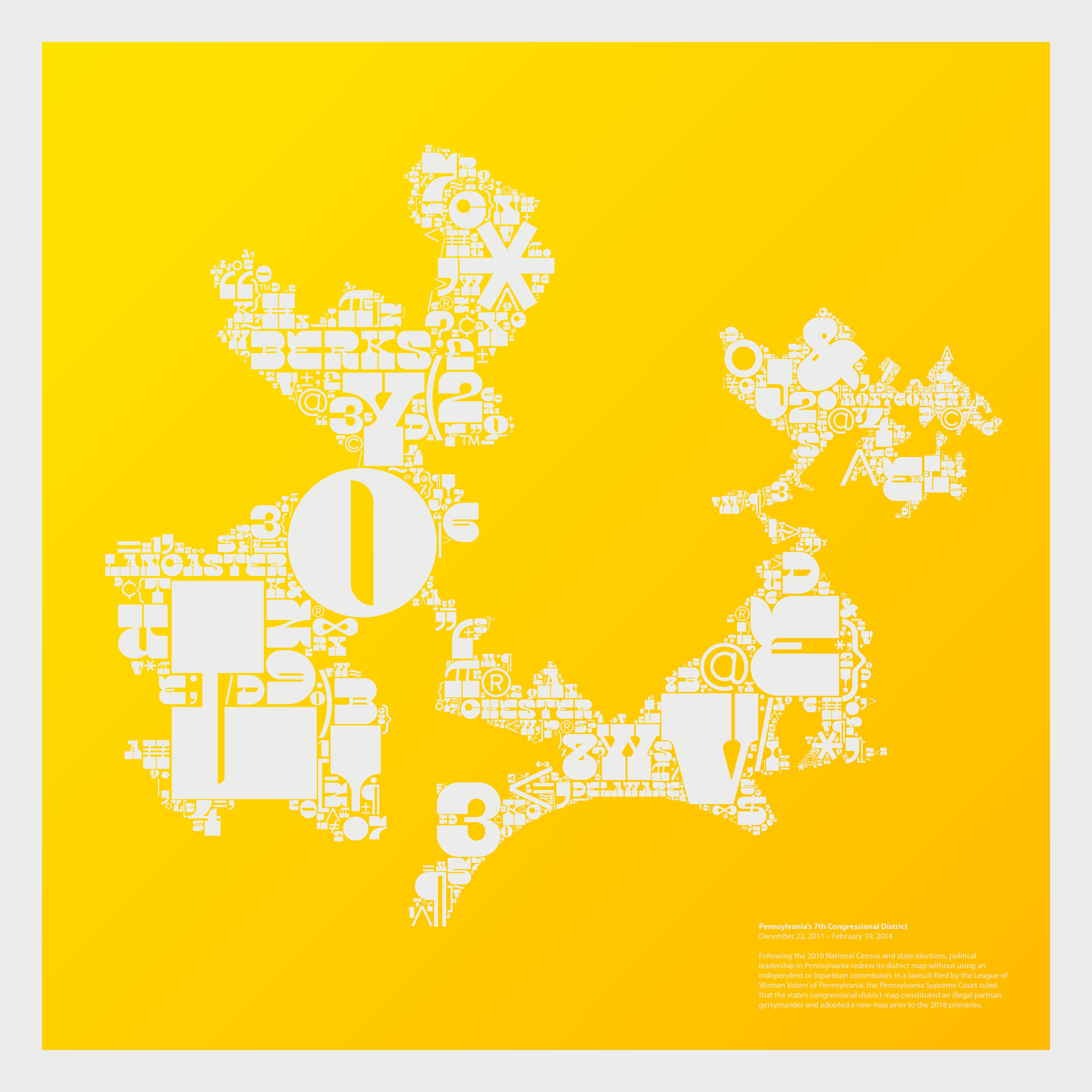
Another method of abstraction is cartography which alters reality in a way for us to move physically and view information more easily. By resizing and compacting my letter forms, I created a tryptic of maps that document recent social and political issues. I specifically chose issues that have recently seen varying forms of resolution or justice as reminders that action and persistence can produce results.
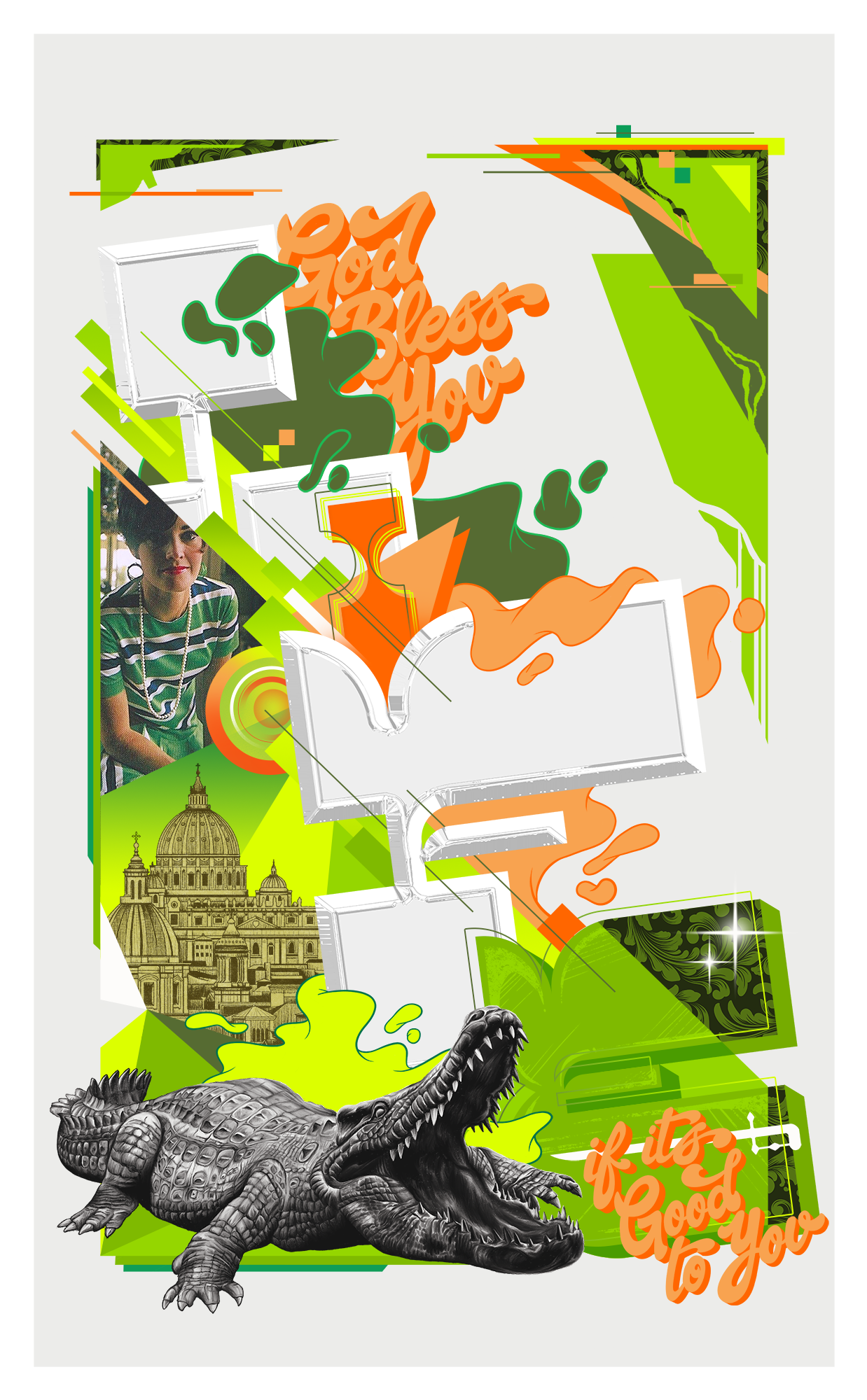
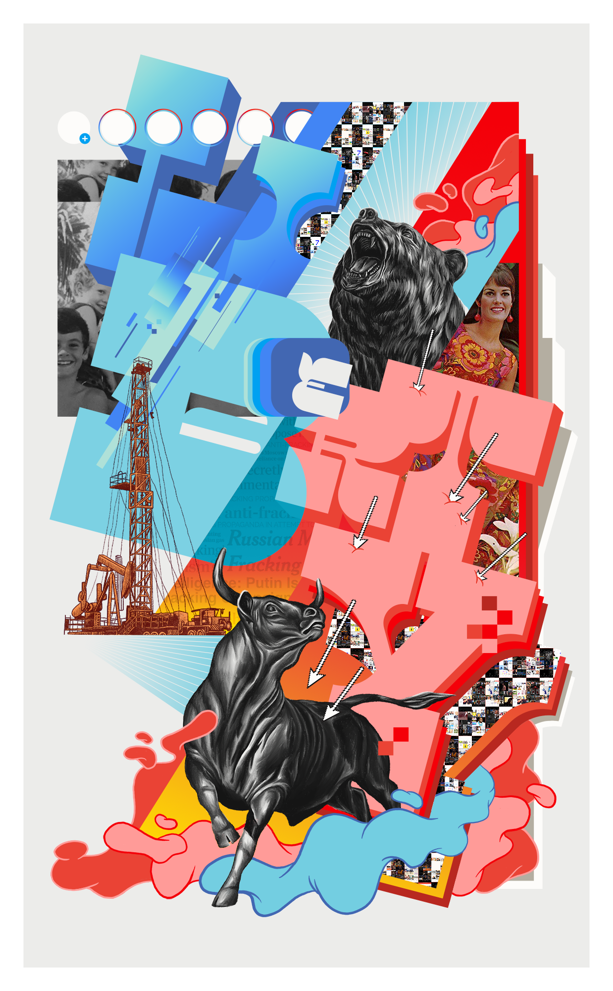
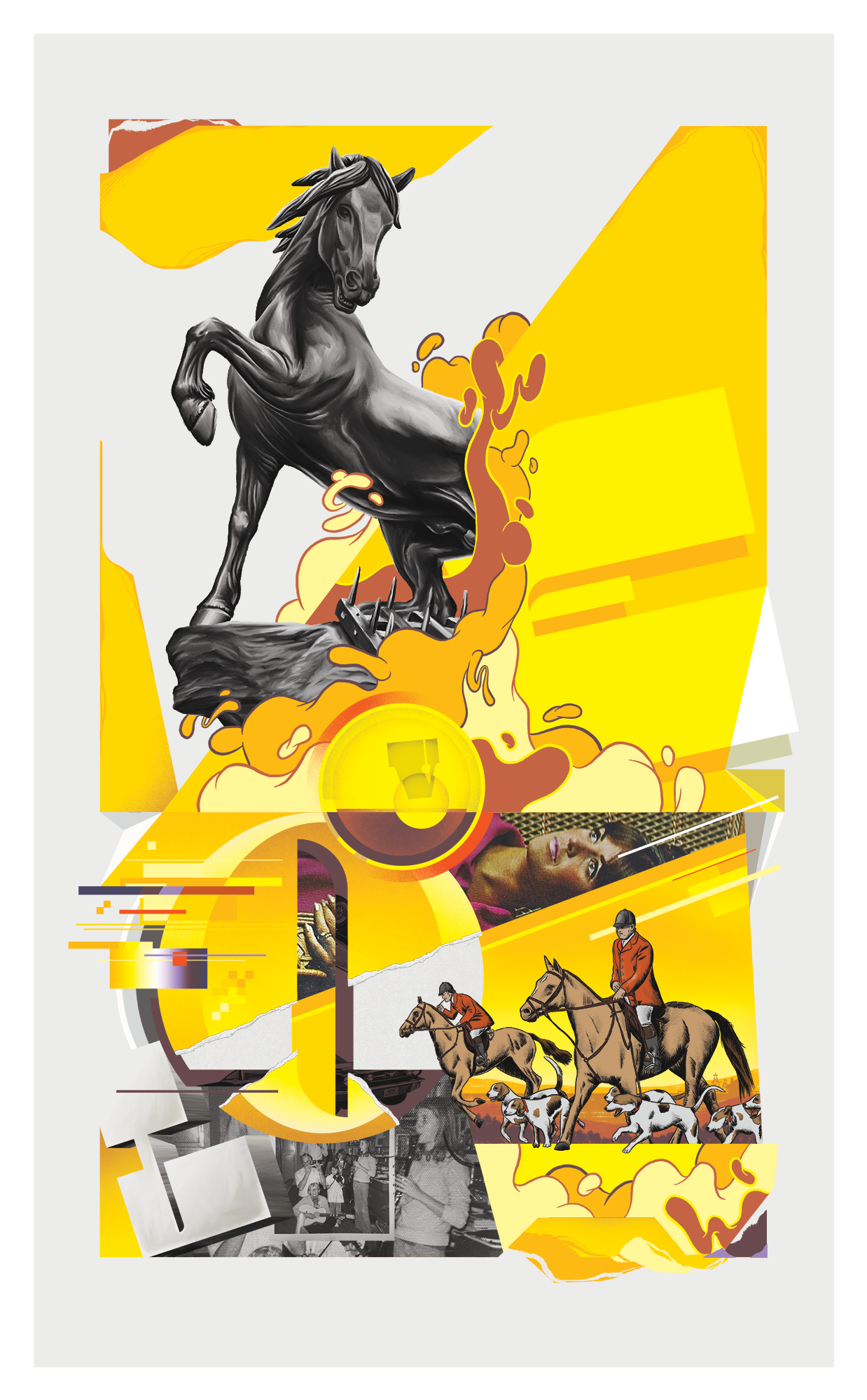
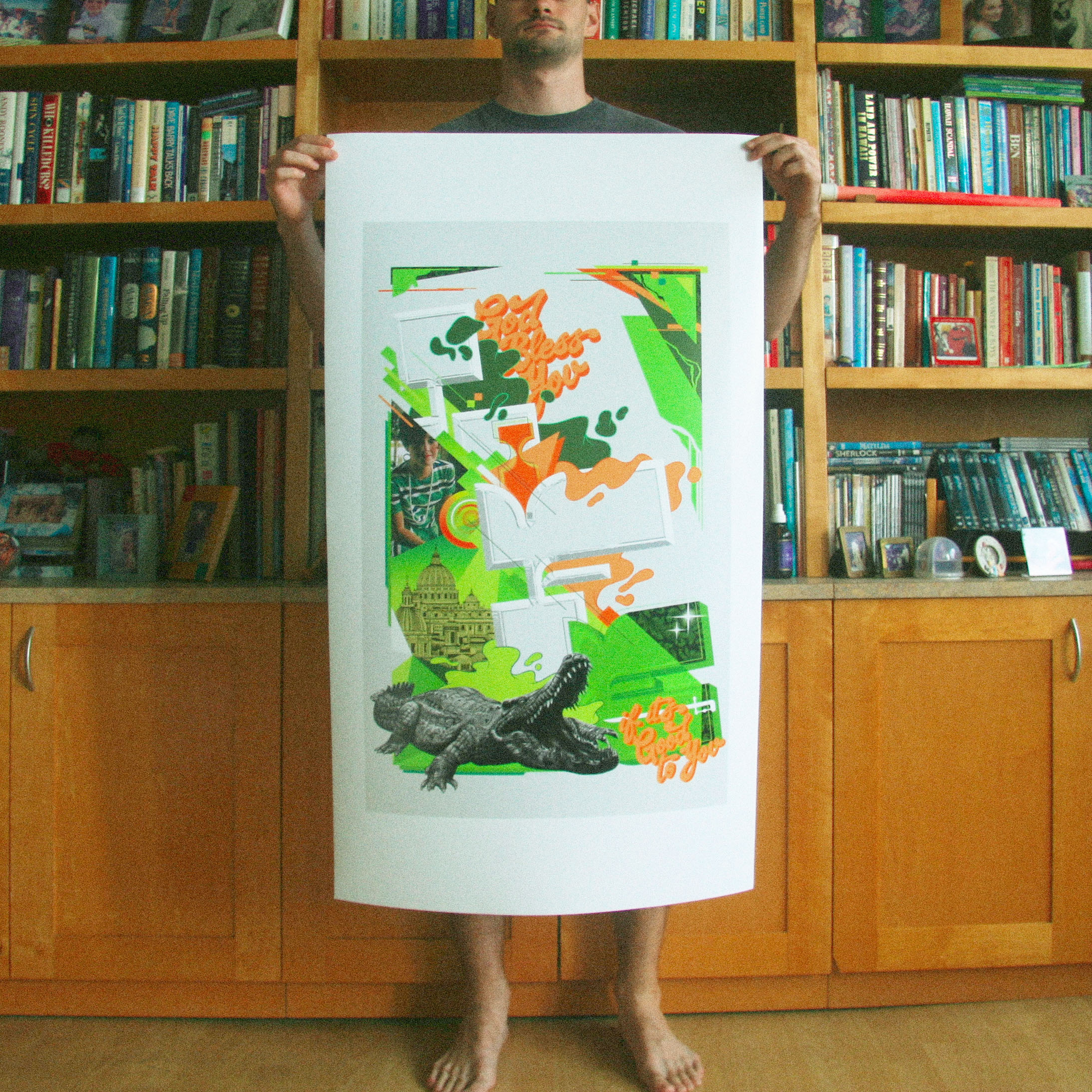
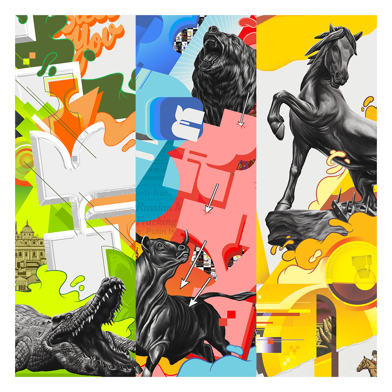
For the final element of my thesis I wanted to incorporate images with my font but in an expressive way that conveyed an effect rather than detailed information. Unlike more formal graphic design, I aimed to construct collisions that aren’t governed by a grid system or hierarchy of objects. The layering and collaging of images, type, and abstract forms can reveal one world beneath another and expose the hidden link between them. Considering this I made another tryptic of posters regarding contemporary issues while letting my influences of graphic art and graffiti show through.
Drawing on years of inspirations and merging them into one project with my investigations and intuitions led to a lot of uncertainty, self-doubt, reexamination, and discovery. However, that process led to growth, both creatively and intellectually, and through this project I found several techniques and influences I can carry into future work.
